Introduction
The purpose of the Daily UI challenge is to practice, and incorporate technical aspects of interface-design. Designers are challenged with expressing their knowledge and understanding of concepts through these fun, yet impactful daily activities.001 - Login Screen
Prompt: Design a login page, model, for, app screen, etc.
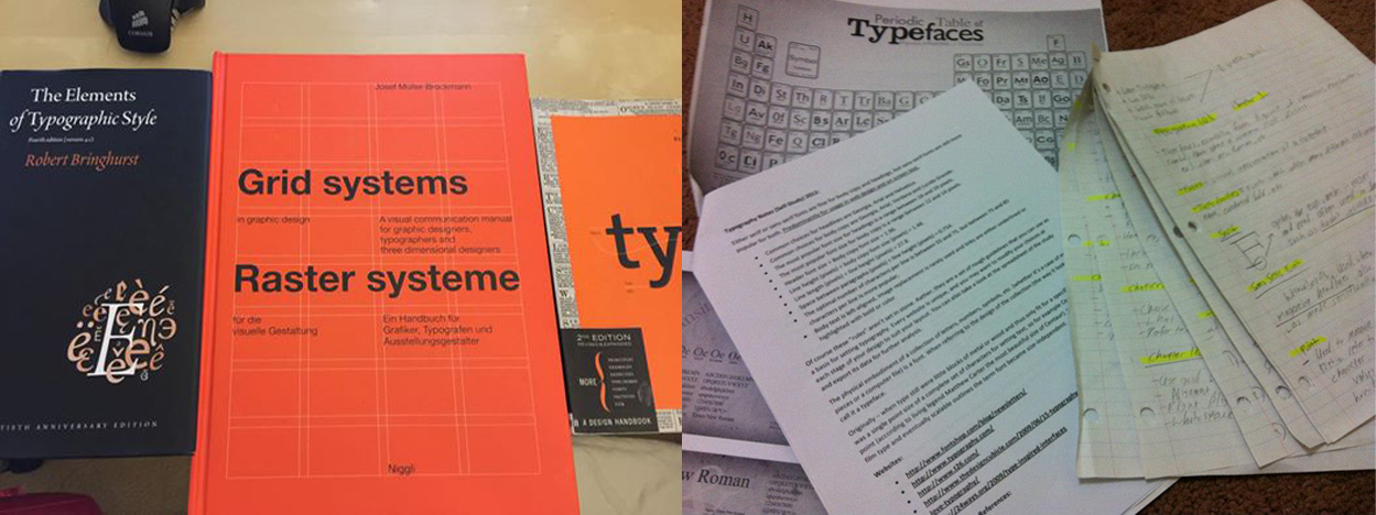
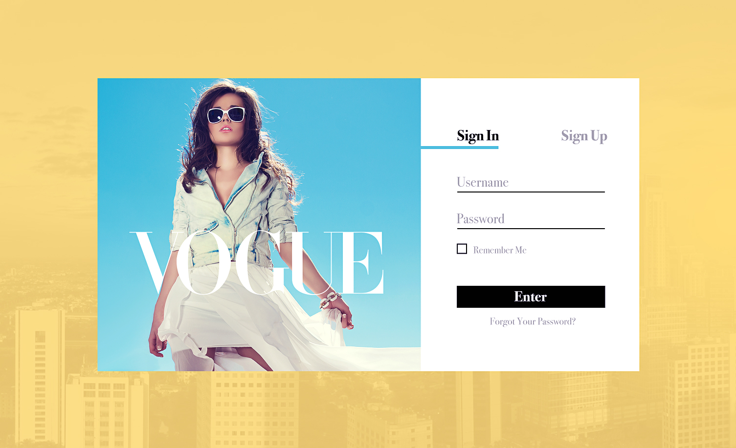
Response: So for the longest time, I’ve wanted to work with something along the lines of fashion. This being the case, I wanted to make a login form for Vogue. As far as the type choices go, I chose Bodoni, which is a serif typeface, and commonly used within the fashion industry. When choosing typefaces, it’s not just enough to see if they can pair well or not, it’s also taking into account, how a particular typeface has been used throughout the ages.
[Some Of My Earlier Typographic Research + My Reference Manual.]
[Final Rendition.]
Now comes the button choice. I originally started with a circular enter button, however I quickly changed my preference to a more square submission button. This is because I realized that the look and feel of this genre was very bold, especially high fashion, everything is very clean cut, and sharp. Things are very angular. Thus, I created my elements around this concept.
002 - Credit Card Checkout
Prompt: Design a credit card checkout form or page. Don’t forget the important elements such as the numbers, dates, security codes, etc.
Response: As of this point, I have been primarily creating my interfaces through a hybrid of platforms such as Photoshop, Illustrator, and Sketch. For this challenge however, I wanted to get better at using Sketch. I decided to create the entire interface in sketch; this includes vector assets, and the implementation of the magic mirror. I have been reading up on the guidelines for iOS 9, and Google’s Material Design principals for some time now, but in light of the new pixel phone release, I decided to opt for the Material Design. As far as color schemes go, this time around I opted for subtle tones of blue. The color blue is commonly seen on corporate websites like twitter, LinkedIn, and even Microsoft. The psychology behind blue is as follows, the color wheel principal in visual communications design still applies here.
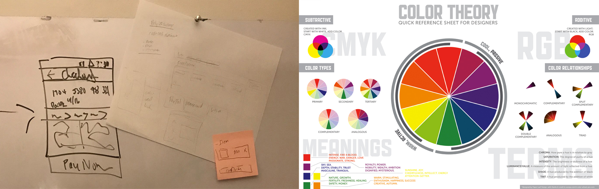
[Quick Wireframe + Color Theory Reference.]
Often times in this new digital era, we tend to feel a disconnect between the physical assets, and there digital representations. This being the case, I wanted to visually display an actual credit card replica for the users to directly input their values into. By representing it this way, it becomes a lot more intuitive as to where precise numbers are going to be placed.
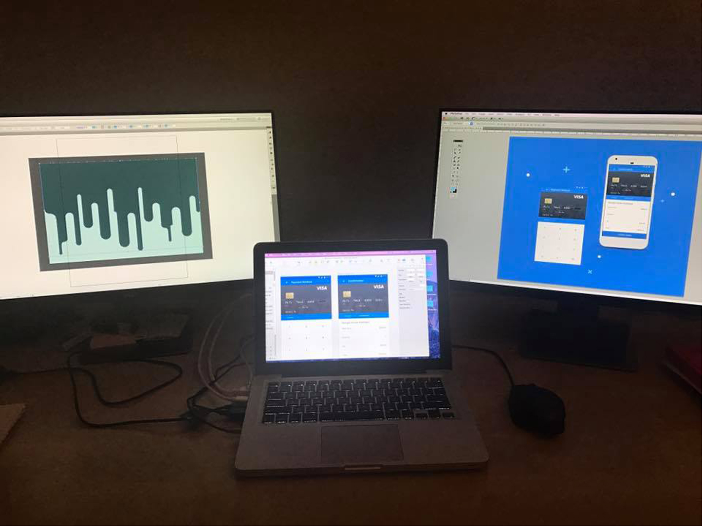
[Illustrator For Vectorized Assets, Sketch For The UI Design, And Photoshop To Put It All Together.]
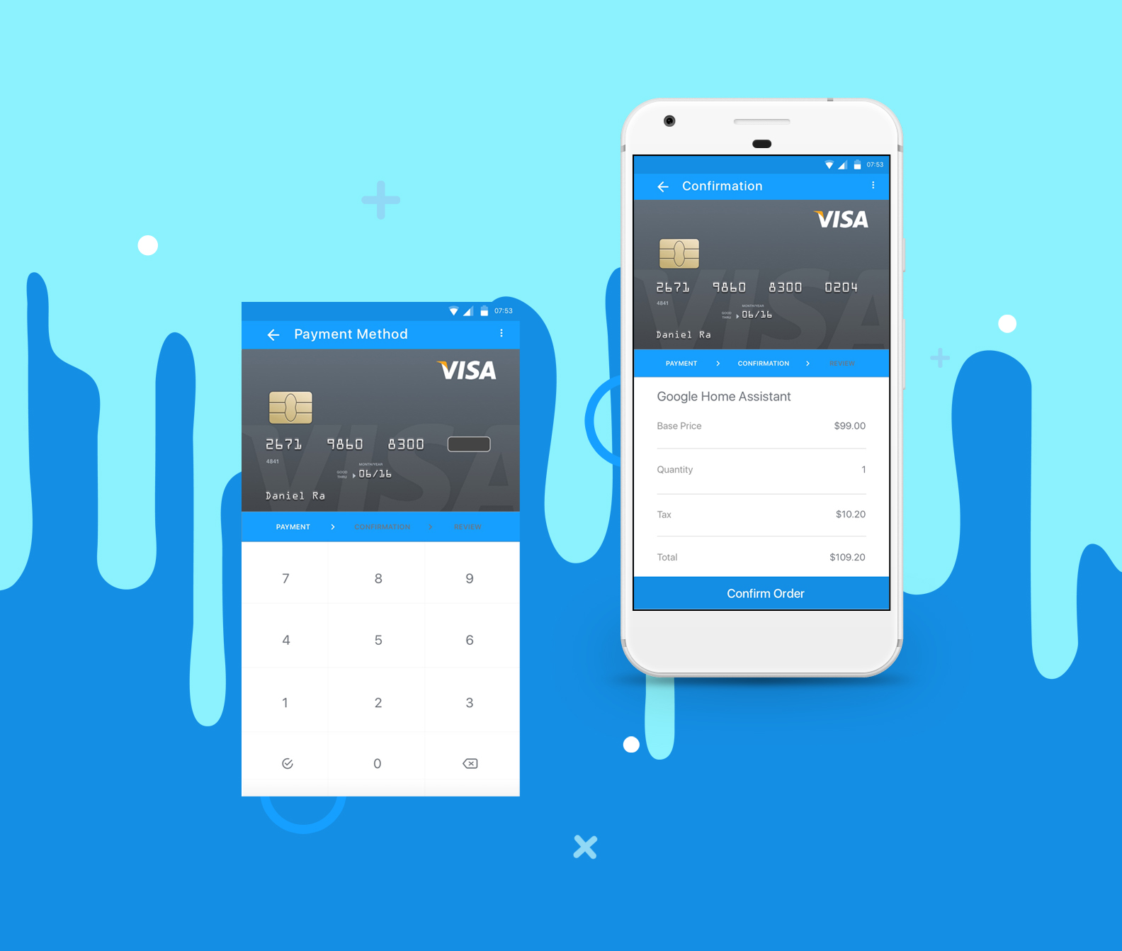
[Final Rendition.]
003 - Landing Page
Prompt: What’s the main focus? Is it for a book, an album, a mobile app, or a product? Consider important landing page elements (call-to-actions, clarity).
Response: CoBuy is a platform that enables friends, and family to purchase real estate together. I won’t go into too many details here, as I will be hosting a separate case study on this, but I ended up using a previously scrapped version of this project for this UI challenge.
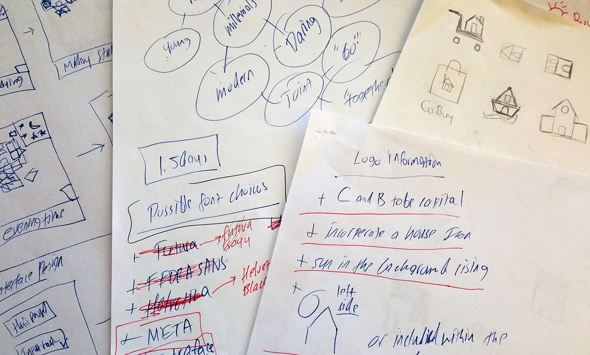
[Brainstorming.]
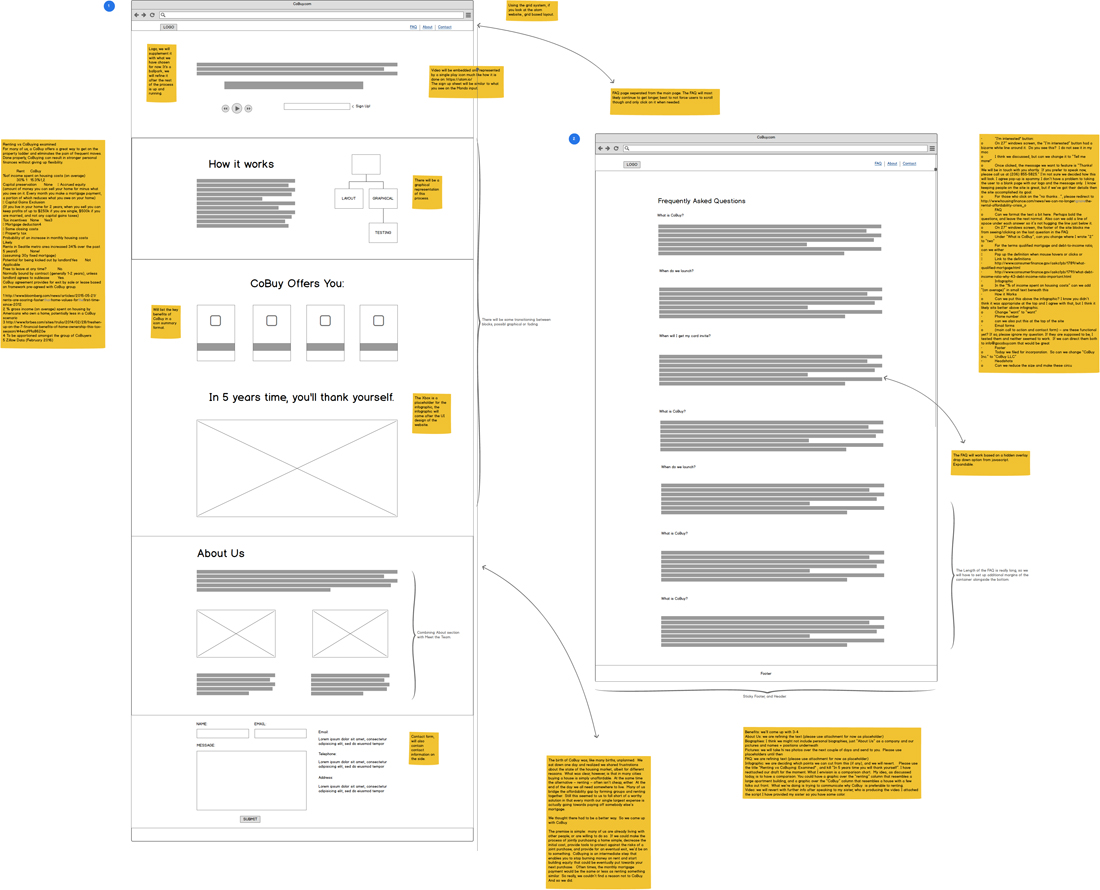
[Wireframe Analysis.]
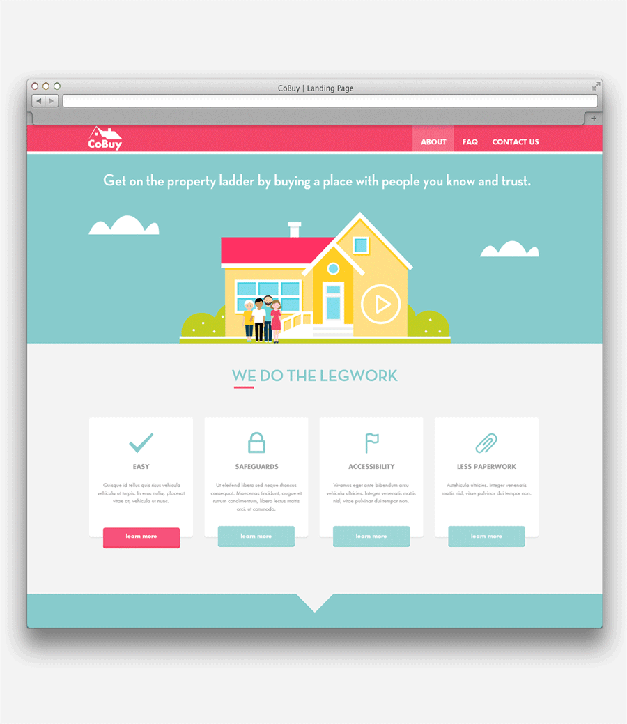
[Final Rendition.]
004 - Icon Illustration
Prompt: Design an app icon. What best represents the brand or product? Or is it incredibly unique? Does it look great at a distance and does it stands out when put on your home screen alongside other apps?
Response: Up to this point, I have been primarily doing my interactions within Photoshop. However, this isn’t necessarily the best way to go about things. Photoshop is clunky, and managing frame by frame animations is a lot less automated, sure you can essentially do the same animations within Photoshop as you could in After Effects, but it would take several times longer, and probably wouldn’t be as effective or efficient as it would have been to do it in After Effects in the first place.
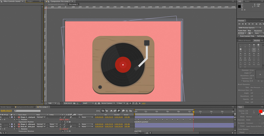
[After Effects Workflow.]
This being the case, I started taking some courses on After effects and created a key frame interaction for this challenge. I also looked into various Javascript plugins that helped convert AE interactions into react-native.
Lottie
Incubator Facebook
Bodymoving

[Final Rendition.]
008 - 404 Error
Prompt: Design a 404 page. Does it suit the brand’s style?
Response: I didn’t quite get to finish this design, as I was too caught up with school and work (I’m currently working close to 70 hours a week). For this project, I wanted to really combine my knowledge of Adobe Illustrator, and After Effects to create powerful animations. I was practicing synchronized key frame looping animations, where I could create short 4-5 seconds interactions that could be smoothly looped into cycles. I spent the morning illustrating the duck, and waves from scratch, and then exported my layout into AE. I then messed around with key frames, and time lapses to generate a short movie that I later exported into Photoshop for GIF processing. I spent quite a bit of time figuring out the right settings by googling up the pros and con’s of each before I finally settled upon the following:
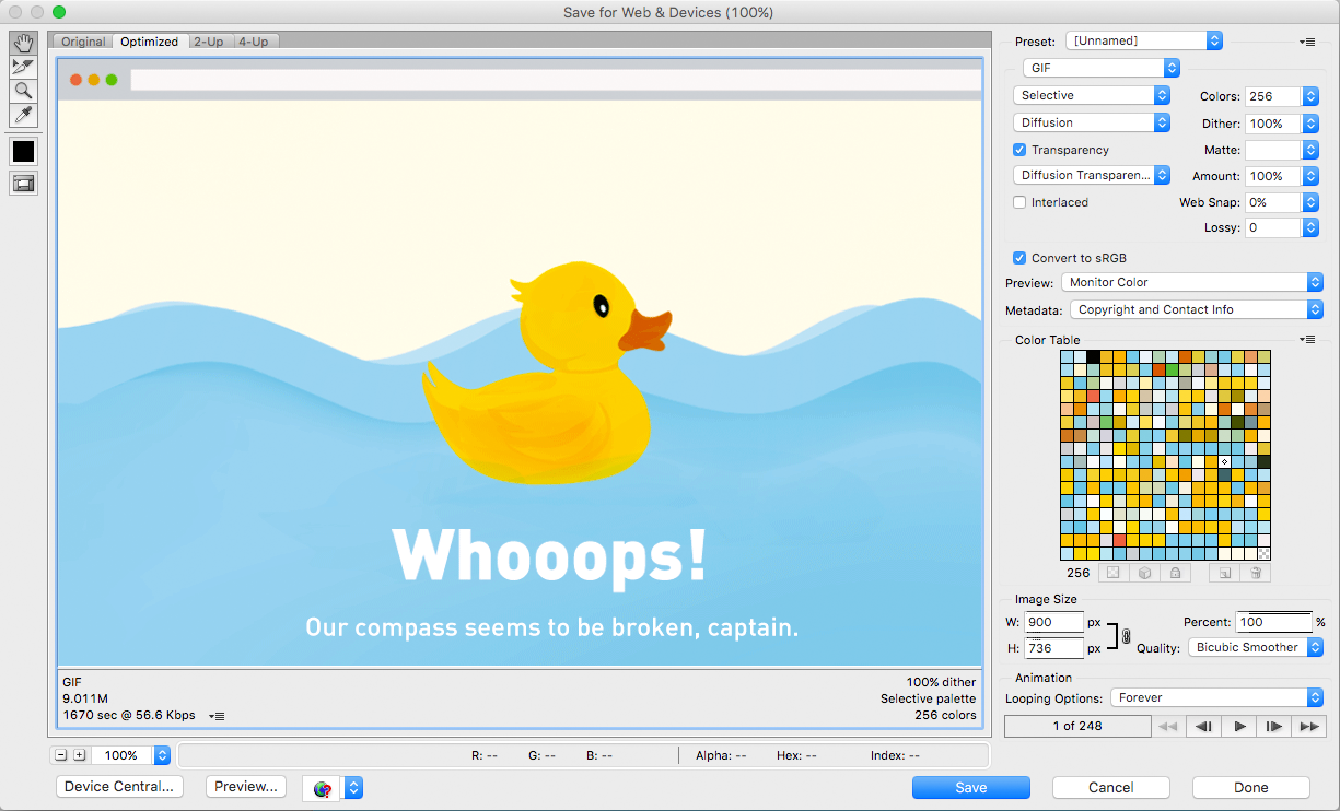
[Photoshop Gif Optimization Settings.]
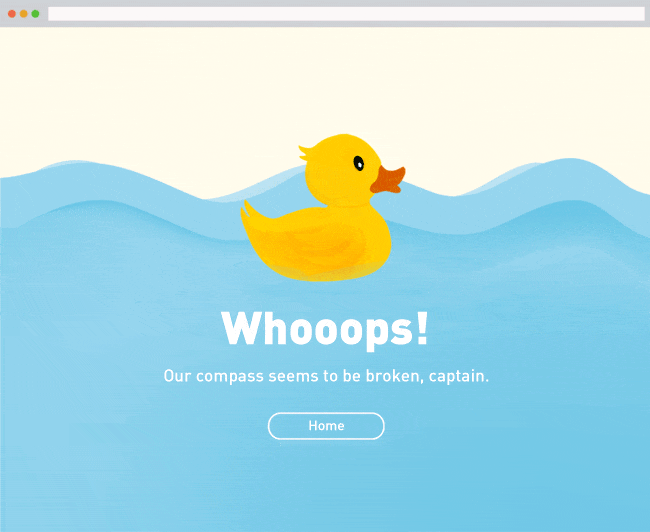
[Final Rendition.]
00X - Logo Design
Prompt: Design a logo for Dr. Choy's private practice in Hawaii.
Response: Hawaii has a very affluent oriental population. This being the case, Dr. Choy wanted his logo to embody both his islands heritage as well as his studies within Dentistry. I had to think about this for a while, but I ended up infusing a dental implant with an origami folding texture. I then chose Helvetica as a typeface, because I believed that a grotesk style was befitting of such an assignment. It also helped that the family was predominantly used within corporate signage, and communications in the past. Finally, I chose vibrant colors that invoked a lot of the more pleasant emotions in psychology such as happiness, and calmness. I then relayed this scheme to embody a sunset reflecting over an ocean.
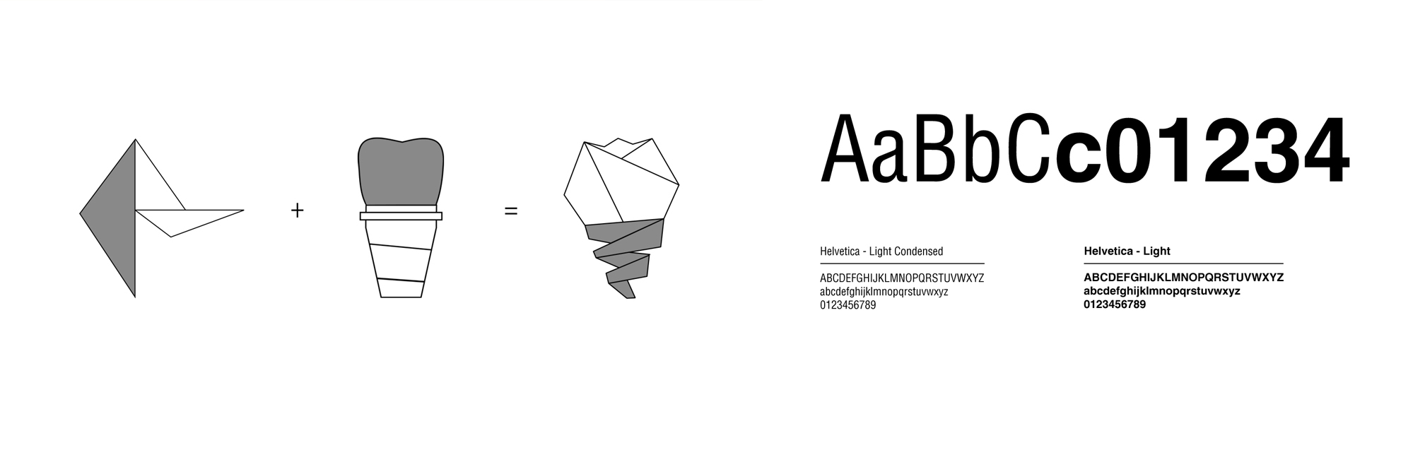
[Origami Styled Dental Implant Ideation + Helvetica Typeface Iterations.]
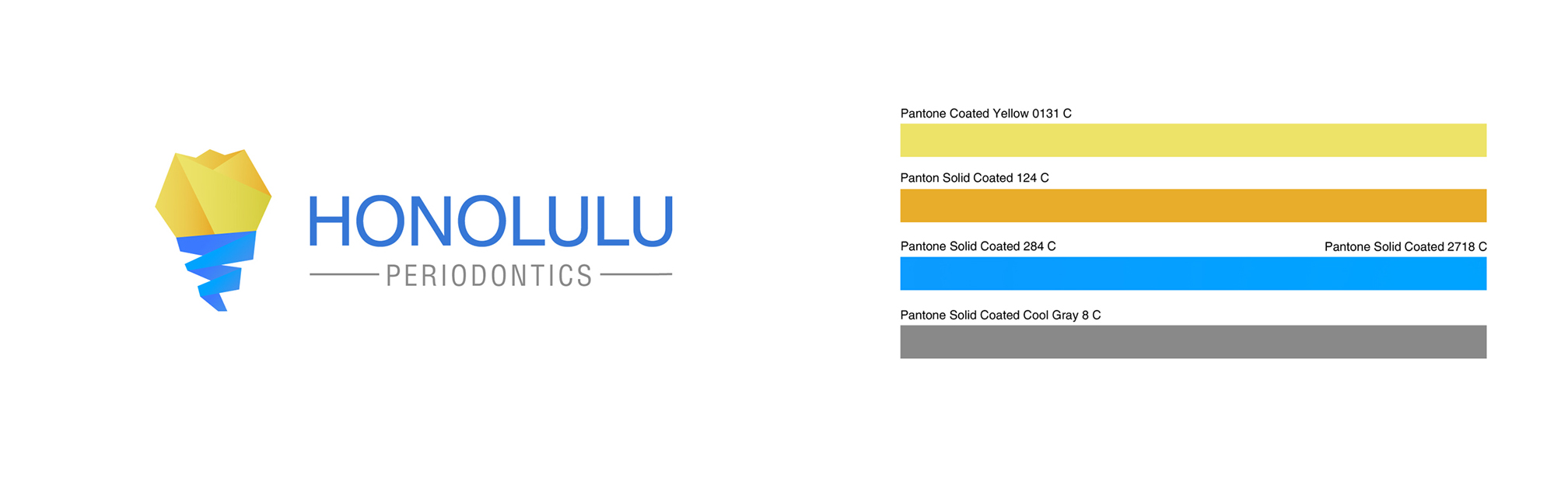
[Final Rendition + Finalized Pantone Color Implementation.]
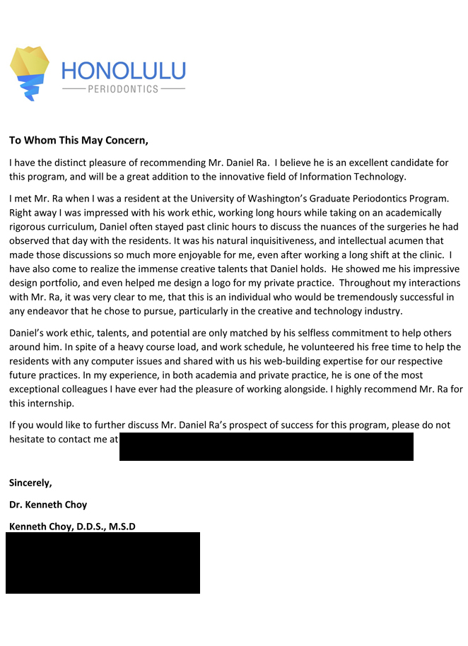
[Letter of Recommendation.]